Prior to acquisition, Mellow was positioned as a medical marijuana delivery service. New ownership sought expansion by providing high-quality products at volume.
We updated the brand on spec, focusing on connecting with a broader recreational audience.
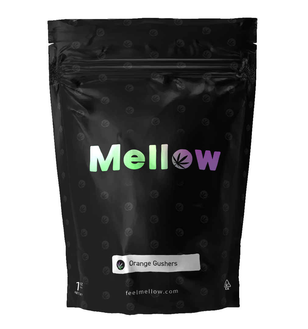
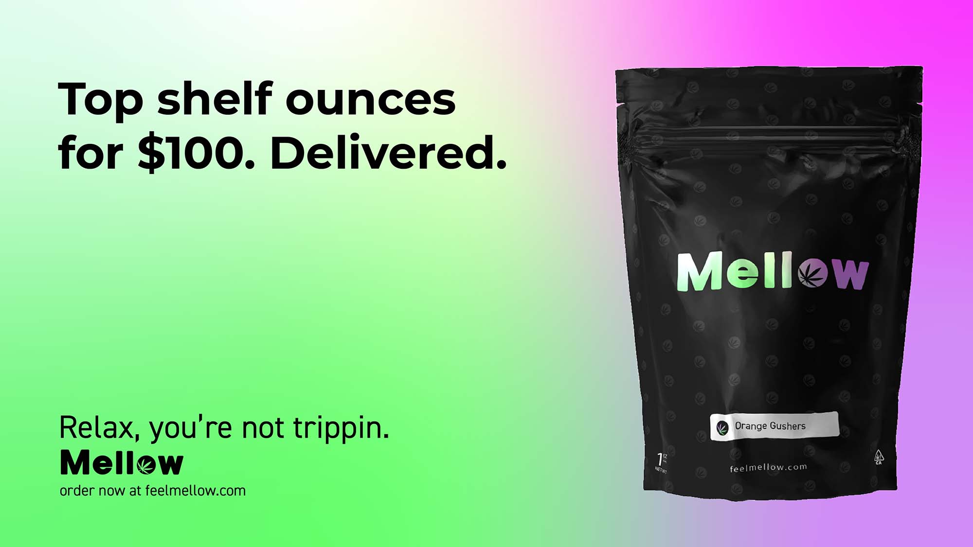
Retaining the bones of the original mark, we built the foundation of the identity on its namesake – there couldn’t be a better association for a stony brand than mellow.
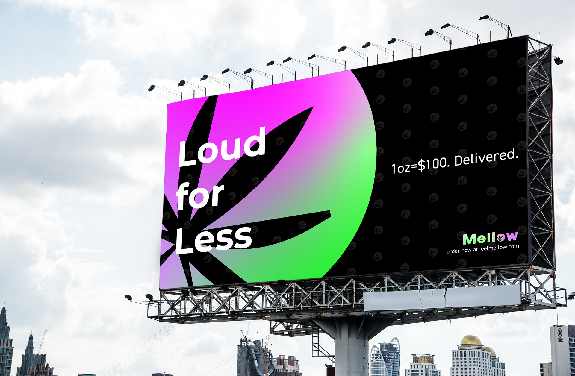
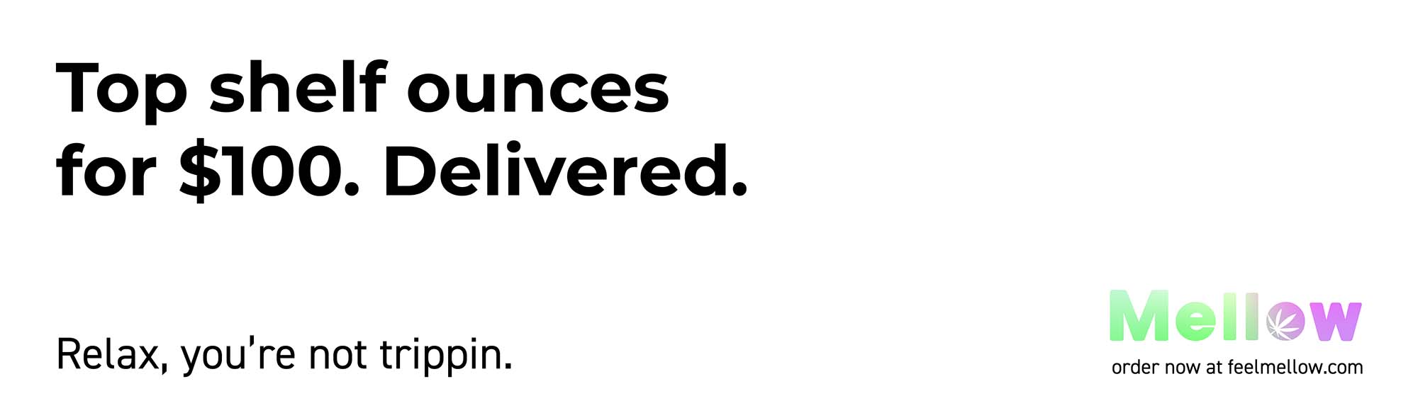
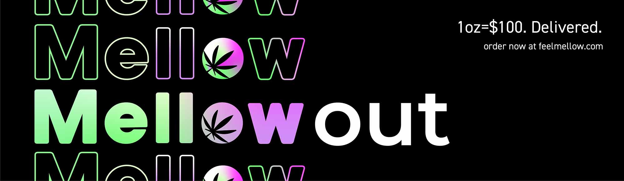
By leaning into a cool aesthetic, smoothing the visuals, and using slick and soft textures, we crafted a solid brand to stand out within an increasingly saturated and highly competitive market.
The logo was updated by opening up the kerning and rounding out the lines. we employed the traditionally associated colors of sativa and indica, purple and green, as strain indicators.
We created “Mel” — the Mellow Mascot — to give the brand a voice (Mel tells it like it is — straightforward and comedic).
In addition, we introduced the Mellow Meter to communicate status, strain, and potency — ‘how toasted are you?’